Prop
It is a Pre-Defined Property of a Component or Control.
It is commonly used to extract data from the Component-Interface or API Property.
INFO
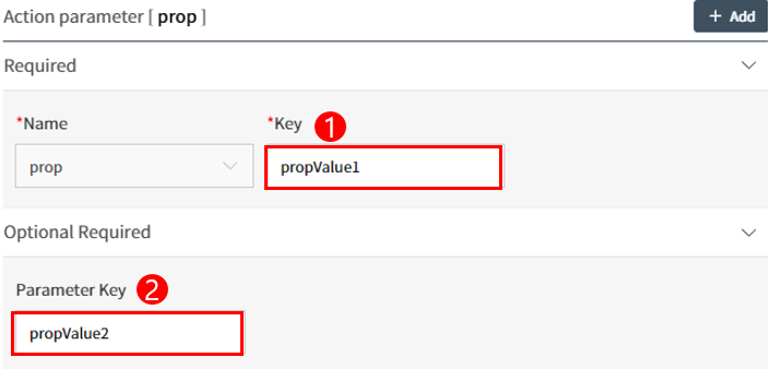
The Key represents the Pre-Defined Property of the Component or Control being configured for the Action, and a pre-defined propValue1 is re-declared to propValue2 using the Parameter Key.
Component-Interface Convertible Component Property
| Name | Description |
|---|---|
| nonAutoFlag | Indicates whether Image Auto Scroll is used as a parameter (Carousel Component property, Yes/No). |
| nextButton | Indicates whether the Next arrow is used as a parameter (Carousel Component property, Yes/No). |
| clickLink | Indicates whether Image Link navigation is used as a parameter (Carousel Component property, Yes/No). |
| logFlag | Indicates whether Lambda saving history for Image Link navigation is used as a parameter (Carousel Component property, Yes/No). |
| src | URL of the Site or Page to be called in the Iframe is used as a parameter (Iframe Component property). |
| currentView | Schedule type is used as a parameter (Depending on the Schedule Component's Schedule type (Day, Week, Workweek, Month, Agenda), the Layout of the Component varies). |
| allowDragAndDrop | Indicates whether the movement of the registered Schedule is used as a parameter (Schedule Component property, Yes/No). |
| allowResizing | Indicates whether Resizing of Schedule item periods is used as a parameter (Schedule Component property, Yes/No). |
| dateFormat | Date format represented in the Schedule is used as a parameter (Schedule Component property). |
Control-Interface Convertible Control Property
| Name | Description |
|---|---|
| shortKey | Shortcut keys for Button type Controls are set as parameters. |
| predefine | Pre-Defined color of Colorpicker Control is used as a parameter (Hex Code 🡪 #0037FF). |
| pickerType | Date entry method of DatePicker Control is used as a parameter (Types include date, year, month, week, dateRange, monthRange). |
| dateFormat | Date format such as yyyy/mm/dd in DatePicker, DateTimePicker is used as a parameter. |
| inactiveBfAf | Date selection restriction in DatePicker, DateTimePicker is used as a parameter. |
| displayDataType | Title and Data display settings of Label Control are used as parameters. |
| parentId | Selected Option's Common Code id in Select Control is used as a parameter. |