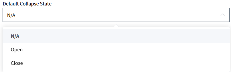
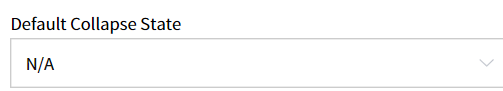
Default Collapse State
When the Collapse Disabled attribute, allowing users to manually collapse or expand a component's screen, is enabled (Collapse Disabled = FALSE), the Default Collapse State attribute can be used to specify the default value. The default value is N/A (=Open), which is displayed in the expanded state. If Close is specified, it will be displayed in the collapsed state.
Note: When the Collapse Disabled value is True, the corresponding attribute is disabled.
[Image1. When Default Collapse State is set to N/A or Open, it determines the initial state of the screen upon entry.]

[Image2. When "Default Collapse State" is set to "Close," it determines the initial state of the screen upon entry.]
- How To Create
- In the Component Attribute View, under Properties
Default Collapse Statecan be configured asN/A(=Open), OpenorClose