Placeholder
This is how you configure a string to display an example of the data entered into the control. You can register a Symbolic String like in Control Display, or specify a string entered as Custom Name for display. Although this property is displayed for all controls as a common property, it's actually applied to Text, Lookup, DatePicker, DateTimePicker, Password, and ZipCodeKR controls.
[Image1. An example of applying Placeholder ]

[Image 2. Studio Control configuration Properties]

When the Placeholder Usage Flag is set to YES, as shown in the top part of the image, Please input is displayed. When it is changed to "No", as shown in the bottom part of the image, an empty value is displayed.

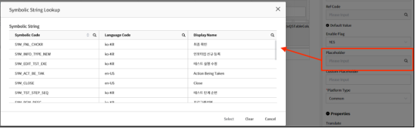
When Placeholder Usage Flag is set to YES, both the user-configurable Placeholder and Custom Placeholder properties are displayed. The Placeholder property can be specified using a symbolic string as shown in the image below. When a Custom Placeholder is specified, the value entered by the user is displayed.
[Image 3. Method for Specifying Placeholder]
[Image 4. When Placeholder is set to Placeholder value]
