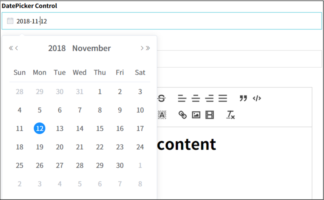
DatePicker
This control allows users to select dates using a user interface element, such as calendar widget, making it easier to input dates accurately and efficiently.
- Applicable List of Control Attributes
- Translate: Configures whether to convert to multiple languages(translation purpose).
- Label: Configures the screen display status, location, and tooltip of the component label.
- Type: Sets the date type, with Date being the default.
- Display Format: Sets the date format. For example, if set to 'yyyy-MM-dd', the date will be displayed as '2023-11-28'.
- Data Format: Sets the format used when passing date data for storage, retrieval, etc.
- PickerOptions: Sets the default date options such as today, current month, previous month, etc.
- Search Condition: Sets the condition operator used when using the date as a search condition. Default is typically INSTR().
- Data Placeholder: Sets an example value for the input.
- InActive Before/After: Prevents selection of past or future dates based on the current date.
- Custom Calendar: Sets whether pre-entered events or schedules are displayed.
- Style
- Font: Sets the font for the string.
- Text Color: Sets the color of the string.
- Flat Appearance: Sets properties of the border, such as width and color.
- Background Color: Sets the background color of the string.
- Text Align: Sets the alignment of the string. Default is typically left-aligned.