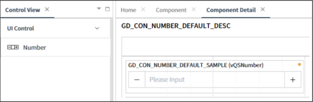
Number
This control consists of a pair of buttons, often labeled with a plus(+) and minus(-) sign, allowing users to increment or decrement the displayed numeric value. Additionally, users can directly input a numeric value into control.
- Applicable List of Control Attributes
Min: Sets the minimum value that can be entered in the Number Control. The minimum and default values are
0.Max: Sets the maximum value that can be entered in the Number Control. The default value is
1000.Step: Sets the increment/decrement value for the Number Control. The default value is
1.Label: Configures the screen display status, location, and tooltip of the component label.
Translate: Configures whether to convert to multiple languages(translation purpose).
Style – Font: Configures the font for the string or text.
Style– Text Color: Configures the color for the text.
Style– Flat Appearance: Configures properties related to the border, such as its width, color, and other settings.
Style– Background Color: Configures the background color of the component.