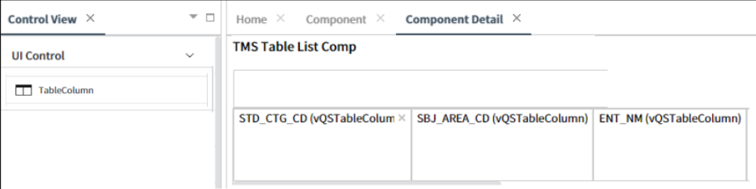
TableColumn
This control is used in list components that are structured in a table format, allowing users to define and customize the layout and content of each column in the table.
- Applicable List of Control Attributes
- Translate: Configures whether to convert to multiple languages(translation purpose).
- UIType: Configures the type of UI.
- Params: When the UI type is Link,configuring the parameters to be used when calling the URL.
- Searchable: Configures whether the column is searchable.
- Search: Configures the search type.
- Sortable: Configures the sorting capability of the column.
- Icon: Configures the usage of icons in the column.
- **RangeOption:**Sets the display format of cell values. In addition to common values such as text or numbers, it can also display values as special formats such as
(Rating(★★★★☆)orProgress(■■■■□) - LinkOption: Configures whether to display cell values as HTML tags.
- Formatter: Configures the value format in the cell
- Summary: Sets the display format of the data based on the information registered in prefix, suffix, function, and label.
- Use Fixed Header: Configures whether the header is fixed.
- Style – Size: Sets the size of the cell.
- Style – Font: Configures the font for the string or text.
- Style - Text Align: It allows users to set the alignment of data, with the default value being left-aligned.
- Style – Text Color: Configures the color for the text.
- Style – Background Color: Configures the background color of the component.
- Style - Flat Appearance: Flat Appearance: Configures properties related to the border, such as its width, color, and other settings.