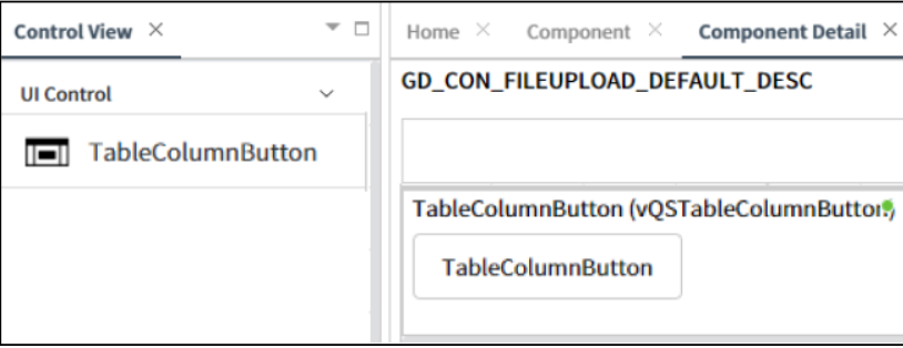
TableColumnButton
This control is used within a list to display buttons that perform specific actions or operations related to each item in the list.
- Applicable List of Control Attributes
- Translate: Configures whether to convert to multiple languages(translation purpose).
- Icon: Sets the icon for the column.
- Use Fixed Header: Configures whether the header is fixed.
- Style – Font: Configures the font for the string or text.
- Style – Color: Configures the color for the text.
- Style – Background Color: Configures the background color of the component.
- Style - Flat Appearance: Configures properties related to the border, such as its width, color, and other settings.