List
It's a component that represents data in a list format with multiple rows.
- How to Create
- After selecting
Listtype in New Component Popup, clickNextbutton. (Step1) - Enter the Component Name, the name displayed on the screen (
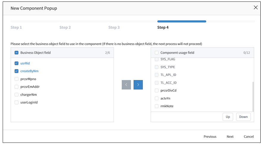
Symbolic Stringor Custom Name), and then select created Business Object, then click theNextbutton. - Select the fields of the Business Object that will be displayed in the list. The displayed fields are those included in the selected Business Object, with CALS System Fields selected by default.
INFO
Note: Layout Type selection in Step2 is skipped.
- Applicable Component Attributes
- Tab Pane Id: When the screen is composed of a Tab Component and the corresponding component is placed at the bottom, then Panel Id value of the Tab Component is registered and used to connect to the Tab.
- Use Checkbox: Set whether to add a checkbox at the left end of each row in the row. It allows multiple rows to be selected.
- Single Check: Change the setting from using checkboxes to using radio button for single selection by selecting
Yesin theUse Checkboxoption. By default, it is set toNo, and changing it toYeswill add a column with radio button at the beginning of each row in the list. - Reverse Check: By default, the checkboxes in the list with the
Use Checkboxsetting are initially displayed as selected. Changing it toYeswill display the checkboxes in the list as selected by default. - Use Summary: Set whether to use the Summary Row. After enabling this option, additional configuration is required for the Control displaying the Summary Information.
INFO
Note: Additional properties to be configured in Control (Summary: prefix, suffix, function, label)
- Use Stripped Table: Select whether tokn use the Striped Style (alternating row coloring) for the List. The default value is
No, and changing it toYeswill display background color of rows in Striped Style. - Inline Edit: This is a function that allows users to add,modify, or delete data within the lis. The default value is
No, and changing it toYesallows selecting functions (New, Edit, Delete, Save, Cancel) to be performed via Edit. For saving and deleting, you need to register the row-inline-save and row-inline-delete services, respectively. Additionally, a separate configuration is required for Inline Edit in the TableColumn Control, and detailed information can be found in the Component Attribute. - Use Drag and Copy: Add drag-and-copy functionality to the List.
- Mobile Display Type: As a mobile-specific attribute, you can choose the format of the Lsit displayed on mobile devices.
- Page Navigation: Set the Pagination Type for displaying the retrieved data. The default value is Scroll Navigation, which displays additional data in the List by scrolling down. Choosing Button Navigation will change the pagination style to one where users can directly navigate to the desired page at the bottom of the list.
INFO
Note: Depending on the loading type, additional properties can be configured(Scroll – Page Size/ Button – Page Size Items, Default Page Size, Use Go To Page).
- Personalization: You can display Control and sequence on a per-user basis through personalization settings.
- Display Row Number: Display a sequence number for each row in the List. Show the sequence number based on the sorting criteria organized in the BO or provided by the Component.
- Display Full Size Fixed: The component can be displayed in full-size on the screen.
- Style - Size: Set the size of the Component, specifying it in pixels or percentage units.
- Style - Background Color: Set the background color for the Component.
- Style – Outline: Set the type of outline for the Component.
• Available List of Services
| Name | Platform | Description |
|---|---|---|
| load | Common | Event that occurs when data loading |
| row-click | Web | Event that occurs when clicking a row in the list. |
| row-dbclick | Web | Event that occurs when double clicking a row in the list. |
| row-inline-save | Web | Event triggered when the Save Button is clicked to Save Data in a List using Inline Edit Mode |
| row-inline-delete | Web | Event trigerred when the Delete button is clicked to delete data in a List using Inline Edit Mode |
| row-touch | Mobile | Event triggered upon touching a row in the list |
| row-dbtouch | Mobile | Event triggered upon double touching a row in the list |
- Availabe List of Controls
- Button: Actions registered as events trigerred by clicks or touches can be invoked.
- Hidden: Controls can be hidden when the application is executed.
- Lookup: To initiate a search, you can call a popup window, where users input search criteria and execute the search.
- Text: It is an Input Text Form Control.
- Select: It is a dropdown list, a Select Control, where you can choose an option. It utilizes the Group Code registered under
Common Codeto set the option values for the Selecting Control. - Editor: It is a control used for editing simple document files.
- Password: This a control used for masking the display or input of passwords or sensitive information.
- ImageUpload: It is an Image Upload Control.
- Textarea: Unlike
Textcontrol , this control allows for resizing and input of multi-row text. - Radio: Radio Button, display the items of Radio Buttons by setting the Group Code registered under
Common Code. - CheckBox: It is a Checkbox Control.
- DatePicker: A control for entering dates, allowing users to easily select dates.
- DateTimePicker: A control for entering dates and times, allowing users to easily select both.
- Label: It is a read-only control. It can display fixed values or field values from a Business Object.
- Dynamic: A dynamic control that is generated and used dynamically on the screen when a component is called in a Service's Action (such as Component-Interface, Control-Interface), with the Control Type set as metaData.
- ZipCodeKR: Allows searching and setting addresses. In the Component, after searching for an address,postal codes, addresses, and detailed addresses can be mapped.