ToolbarForm
A toolbar can be added to a Form-type Component, allowing the addition of buttons and functionalties such as input and save.
- How to Create
- Select
ToolbarFormtype in New Component PopupToolbarForm. (Step1) - Enter the Component Name, the name displayed on the Screen (
Symbolic StringorCustom Name) and then choose the created Business Object,then clickNextbutton. - Choose the Business Object to be used in the Component, then select fields of the Business Object to be used in the Component
INFO
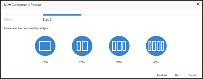
Note1: For the convenience of screen layout, we provide Layout Types divided into 1 to 4 segments. Among these, you can choose the appropriate layout to set up the workspace in the Component Canvas(Detail) and configure the Components.
- Applicable List of Component Attributes
- Tab Pane Id: When the Screen is structured with a Tab Component and this Component is placed at the bottom, the Tab Component's Panel Id value is registered to link it with the Tab.
- Label: Used as the label for the Field, and its display position can be changed (Top: above, Left: to the left).
- Control Spacing: You can set ot change the default spacing between controls inside a Form or between controls. Default Value for Column Spacing is 15, Default Value for Row Spacing is 20.
- Collapse Disabled: This attribute determines the collapsing behavior of the Component. The default value is
No, meaning that the collapse functionality in the Content area is enabled. Setting it toYesdisables the collapse functionality, keeping the Content area expanded at all times. - Default Collapse State: This attribute, applicable when Collapse Disabled is set to
No, sets the initial state of collapsing upon entering the screen. The default value isN/A, indicating that the collapse feature is enabled. Changing it toClosemeans that the screen will initially load with the collapse closed. - Toolbar Position: Toolbar Position: This is an attribute that sets the button position of the toolbar. The default value is Top, and the selectable values are Top and Bottom.
- Available List of Services
| Name | Platform | Description |
|---|---|---|
| load | Common | Event that occurs when data loading |
- Load: This a service that runs when the Form Component is loaded, and it must be registered to bind the data
INFO
Note2: Feature of Load Service Action Design: The Load service configuration differs based on whether it's for new or modified entries.
a. New Form Component: Button Control is linked to it, and a Popup window is invoked using Popup Action in the Click Service. 
b. Edit/Modification Form Component: When the link is clicked, a Popup window is invoked using Popup Action in the Link-click service. 
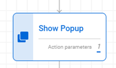
c. The Show Popup action is utilized: The Show Popup used in both New and Edit actions sets the URL in the Action Parameter of the Path item and, in the Edit action, additionally regisiters the SysId of the Data included in the Component's Control that calls the Popup in the ControlId.
(Popup Service Icon)
WARNING
※Note: Set the Show Popup Action in the Link or Button Service of the Component that calls the Form Component.
(New Popup Service)
(Additional configuration for ControlId in the Modification Popup Service – sysId)
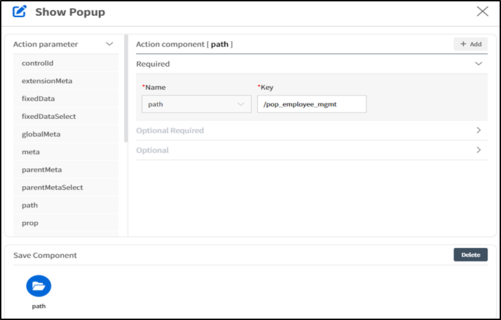
d. Distinguishing between new and modified forms with the Check Action: When it is a modification, it is checked by the Prop name of the screen calling the Popup before executing the Lambda Action that loads the Data.
(The Check Action Icon for the Modification Load Service])
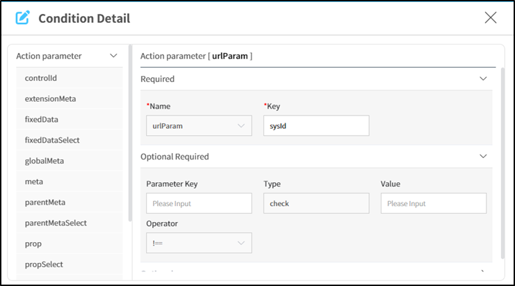
(Detailed Information Screen for the "Modification Not Eqaul Check Action")
WARNING
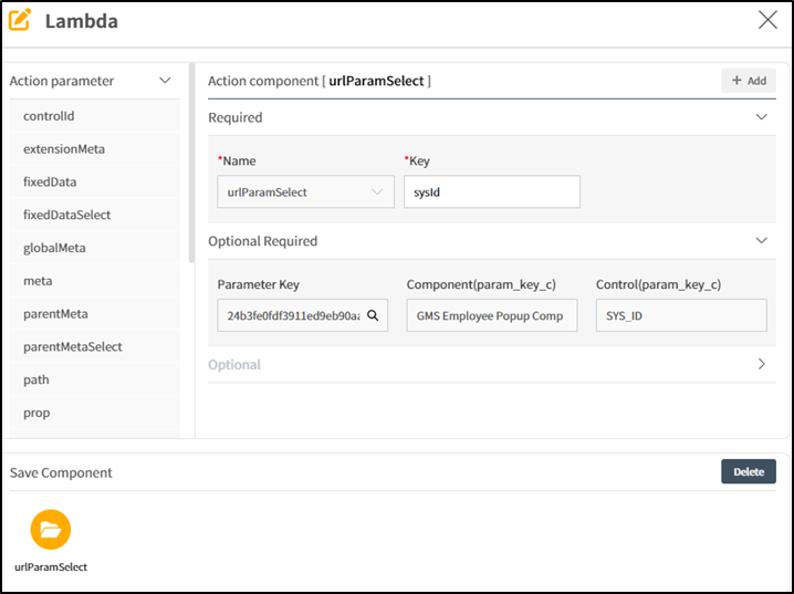
※Note: When calling a new screen via Path, it is possible to pass various information in URL Parameter format by declaring a Parameter key. In this case, the Component receiving the information uses the parameter key declared in the key value ineither urlParam or urlParamSelect. In Form Components, the exitence of the sysid value is primarly used to check whether it a new or edit
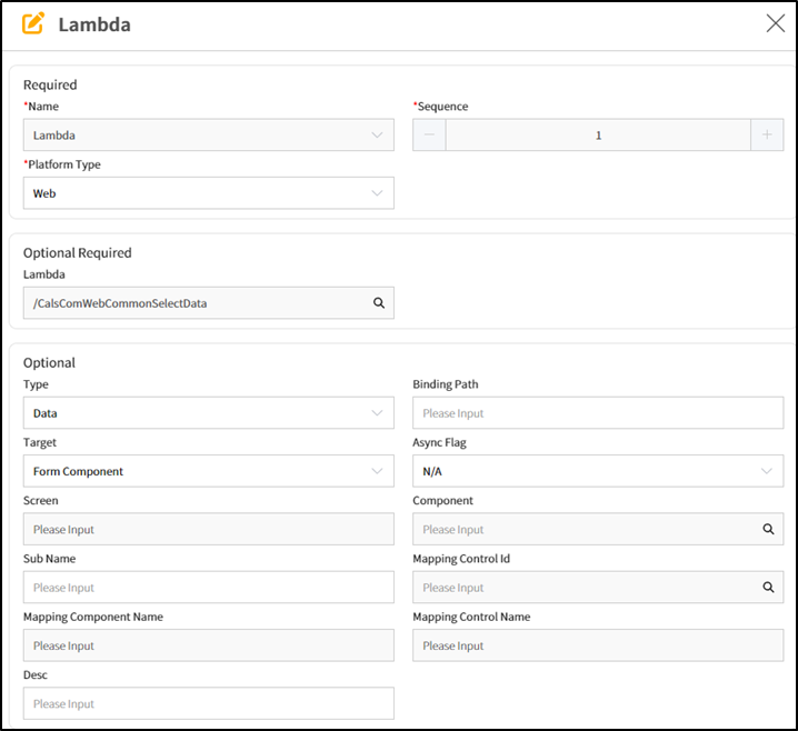
e. Feature of modifying Form Lambda Action: Set /CalsComWebCommonSelectData to Optional Required Lambda to load Data, set the Type of Optional information to Data, and then set the Target type to From Component. Additionally to load Data, configure the search criteria using the Controlid- sysId set in the calling Component.
(Lambda Action Basic Information Input Screen)